

Styling Artisanal Pottery in Modern Homes
Last Updated: October 23, 2026
Quick Summary
Styling artisanal pottery in modern homes works by creating contrast between handcrafted ceramics and clean, minimalist interiors. Choose pieces intentionally, spread them across the room for balance, and use negative space to make each piece a focal point that draws the eye and invites conversation.
- Divide shelves into three zones with roughly 60 percent objects and 40 percent empty space for visual impact.
- Arrange pottery heights in a loose triangle rather than a flat line, using odd-numbered groupings for better composition.
- Pair handmade ceramics with modern materials like metal, concrete, and glass to create intentional contrast and sophistication.
- Classify pieces as decorative only, water-tight, or food-safe before cleaning or using them to prevent damage.
- Display ceramics on focal walls, console tables, mantels, and built-in shelving where they naturally draw attention.
Table of Contents
- Why Artisanal Pottery Works in Modern Interiors
- How to Decorate with Ceramics: Core Principles
- How to Display Pottery on Shelves and Surfaces
- Ceramic Decor Ideas for Living Rooms
- Coastal Pottery Decor Ideas for Every Room
- Pairing Handmade Pottery with Modern Materials
- Choosing Ceramics That Match Your Color Scheme
- Caring for and Maintaining Your Artisanal Pieces
- Frequently Asked Questions
Why Artisanal Pottery Works in Modern Interiors
Artisanal pottery brings warmth and character to spaces that might otherwise feel cold or impersonal. Handmade ceramics add texture, color, and personality that mass-produced décor cannot match.
The beauty of styling artisanal pottery in modern homes lies in the contrast. Modern interiors emphasize clean lines, neutral palettes, and minimalism; handcrafted ceramics break up that severity.
What makes this work is intentionality. Artisanal pottery isn't about filling every surface but choosing pieces that speak to your personal style and displaying them where they'll have the most impact.
How to Decorate with Ceramics: Core Principles
Decorating with ceramics follows a few foundational rules. Master these and you'll decorate effectively in any space.
Start with balance. Don't cluster all your pieces in one corner. Spread them across the room so your eye travels naturally. Balance doesn't mean symmetry, it means distributing visual weight evenly.
Consider scale. A small bowl gets lost on a large dining table; a massive vase overwhelms a narrow hallway. Match piece size to space, especially when styling artisanal pottery in modern homes, where every element is visible.
Think about negative space. Empty space makes ceramics stand out.
Group with intention. When displaying multiple pieces, create a visual story: pair a tall vase with a shorter bowl, mix gloss with matte, and combine heights and shapes so the grouping feels intentional.
How to Display Pottery on Shelves and Surfaces
The most common mistake is treating shelves like storage. They're galleries for your best pieces.
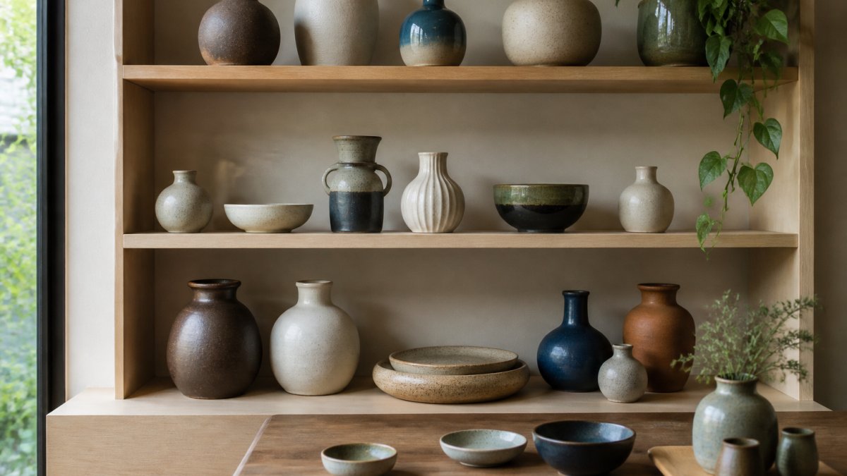
Most styling guides stop at "group in odd numbers and leave space." That advice is true but incomplete. What separates a curated shelf from a cluttered one is a repeatable method for balancing height, shape, color, and negative space.
Step 1: Map the shelf before you place a single piece
Measure the usable width and depth of your shelf. Interior stylists often divide a shelf into three zones: a left anchor, a center focal point, and a right counterweight.
For a standard 36-inch shelf, a workable starting ratio is roughly 60 percent object, 40 percent empty space. On deeper shelves (12 inches or more), push larger pieces toward the back third so the front edge stays visually light.
Step 2: Choose one anchor piece by height
Pick the tallest piece first as your anchor. As a rule of thumb, it should be no more than two-thirds the height of the space between shelves. If your shelf gap is 15 inches, keep the tallest vase under about 10 inches so it has room to breathe.
Place the anchor slightly off-center, roughly one-third in from one edge. Off-center placement feels more natural to the eye than dead center and gives you room to build a counterweight on the opposite side.
Step 3: Build a height triangle, not a height line
Arrange the remaining pieces so their tops form a loose triangle rather than a flat line or staircase. A tall anchor, a medium piece at roughly two-thirds its height, and a short piece at roughly one-third creates a triangle the eye can travel. That's the mechanism behind the "odd-numbered group" advice: odd numbers make a triangle possible; even numbers pair off into flat lines.
Use books, small risers, or a stack of two art books to lift a shorter piece when you need more height variation without adding another object.
Step 4: Balance shape and color across the shelf
Once heights are set, check shape and color. No two adjacent pieces should share both the same silhouette family and the same color temperature. Pair a round, matte, earth-toned bowl next to a tall, glossy, cool-toned vase; the contrast makes each piece legible.
If your shelf already has a lot of visual texture (rough glaze, carved patterns), keep the color palette tighter. If your pieces are smooth and monochrome, you can afford more variation in shape.
Step 5: Audit the negative space last
Step back and look at the gaps, not the objects. You want at least one clear vertical gap running shelf to shelf and visible emptiness above your tallest piece. If every gap holds a small object, remove one piece; the empty space works as hard as the pottery.
This method works on open shelving, built-ins, console tables, and mantels. The numbers are starting points, not rules, but they give you repeatable structure instead of instinct alone.
Ceramic Decor Ideas for Living Rooms
Your living room is where guests spend time and your personal style should shine.
Create a focal wall. Choose one wall with shelving and make it your ceramic gallery.
Use a console table. A low table behind your sofa or against a wall is perfect for larger ceramic pieces.
Choose pieces that match your living room's mood: coastal blues and whites feel relaxed, earth tones feel grounded, geometric pieces feel contemporary.
Coastal Pottery Decor Ideas for Every Room
Coastal pottery brings the ocean inside. Even inland, these pieces create calm and openness.
Bedrooms: A pair of blue and white vases on your nightstands brings coastal vibes without overwhelming the space.
Bathrooms: Ceramic soap dishes, toothbrush holders, and small bowls add function and style.
Kitchens: Display ceramic bowls and vessels on open shelving.
Home offices: A small ceramic piece on your desk or shelf reminds you to slow down.
Coastal pottery decor ideas work because they're versatile, fitting into almost any room without feeling forced.
Pairing Handmade Pottery with Modern Materials
The magic happens when you mix artisanal pottery with contemporary elements.
Metal and ceramic. A handmade vase next to a brass candlestick or steel sculpture creates visual tension: rough, organic pottery against smooth, industrial metal.
Glass and ceramic. Clear glass lets light through in ways ceramic can't.
Concrete and ceramic. Modern homes often feature concrete counters, walls, and floors. Handmade ceramics soften that harshness; the pottery's warmth balances the concrete's coolness.
The rule is simple: let your ceramics be the soft, warm element against harder, cooler materials.
Choosing Ceramics That Match Your Color Scheme
Color is the fastest way to tie ceramics into your room's design.
Neutral rooms: Choose warm neutrals, cream, beige, or soft gray, or go bold with one contrasting statement piece.
Blue and white rooms: The easiest pairing.
Warm-toned rooms: Terracotta, ochre, and rust ceramics complement warm palettes, feeling grounded and cozy.
Cool-toned rooms: Soft blues, grays, and whites work here.
Monochromatic rooms: A single color in varying shades can feel boring.
Choose ceramics that either match your color scheme or intentionally contrast with it.
Caring for and Maintaining Your Artisanal Pieces
Handmade ceramics deserve care, but most guides (dust gently, avoid the dishwasher) skip the question that matters: is this piece decorative, food-safe, water-tight, or all three? Getting that wrong is how people ruin a piece or serve from a glaze never meant for food. Here is how to care for artisanal pottery with that distinction front and center.
First, classify the piece
Before cleaning or using a handmade piece, sort it into one of three categories.
- Decorative only. Unglazed exteriors, raku-fired pieces, and many low-fire finishes are decorative. Raku in particular is porous and not food-safe or water-tight; it should stay dry.
- Water-tight but not food-safe. Many glazed vases and planters hold water fine but were never tested for food contact. Use them for flowers or as dry vessels, not for serving.
- Food-safe and water-tight. Stoneware and porcelain fired to maturity with a food-safe glaze can generally be used for food and drink. Even then, confirm with the maker, especially for anything acidic like citrus, vinegar, or tomato.
Cleaning by category
Decorative pieces. Dust with a soft cloth or feather duster; a soft brush reaches grooves on textured surfaces without scratching.
Water-tight vases and planters. Empty and rinse with warm water between uses. For mineral buildup at the waterline, a dilute white vinegar rinse followed by warm water usually lifts it.
Food-safe pieces. Hand wash with warm water and mild dish soap, then dry fully before stacking. Avoid the dishwasher for handmade pieces because heat and detergent can dull glazes and stress joints.
Protecting glazes and finishes
- Sunlight. Display pieces away from strong direct sun; some glazes and colored clays fade, and uneven exposure leaves visible variation.
- Microwave and oven. Don't assume a handmade piece is microwave- or oven-safe; metallic glazes and some clay bodies are not. Confirm with the maker before any heat use.
- Stacking. Stack sparingly with a soft cloth or felt pad between rims, the most chip-prone part of a handmade piece.
- Moving and storing. Support the base, not the rim, when lifting. For seasonal storage, wrap in soft cloth or bubble wrap and keep in a cool, dry place away from freezing temperatures, which can crack porous clay.
When to repair and when to retire
Hairline cracks in decorative pieces can often be stabilized with food-safe epoxy if the piece isn't used for food or water. Cracks in food-contact or water-holding pieces are different: once a food-safe glaze is compromised, the clay underneath can harbor moisture and bacteria. Retire those pieces to decorative use rather than trying to seal them.
Proper care extends the life of your artisanal pottery and honors the maker's intention and skill.
Frequently Asked Questions
How do you style pottery in a modern home without it looking out of place?
Artisanal pottery complements modern interiors when you treat it as a textural accent rather than a decorative afterthought. Group pieces in odd numbers (three or five), vary heights and shapes, and leave breathing room between objects. This creates visual interest while respecting the clean lines modern design values. Handmade ceramics add warmth and personality that mass-produced items cannot, making them a natural fit for contemporary spaces seeking character.
What colors of handmade pottery work best with modern décor?
Neutral tones like cream, soft gray, and natural clay pair effortlessly with minimalist and Scandinavian interiors. Blue and white ceramics complement coastal and transitional styles. For bolder modern spaces, consider jewel tones or matte black pieces that create striking focal points. The key is choosing one dominant color family and repeating it across your display, this creates cohesion while the handcrafted variations in glaze and surface design add depth.
How many pottery pieces should you display together to avoid clutter?
Start with three to five pieces as a grouped collection, this number is visually balanced and prevents the space from feeling chaotic. Odd numbers feel more intentional than even groupings. If you have more pieces, create separate displays in different rooms or on different shelves rather than crowding one surface. Remember that negative space (empty room around objects) is as important as the pieces themselves in modern design.
Can handmade ceramics work in minimalist homes, or will they feel too busy?
Yes, artisanal pottery fits minimalist design when you're selective and intentional. Choose one or two statement pieces with subtle glaze variations rather than multiple patterned items. Display a single ceramic vase on a shelf with significant empty space around it, or use a handmade bowl as a functional décor piece on a coffee table. The key is restraint, minimalism values quality and meaning over quantity, which aligns perfectly with handcrafted, artisanal work.
